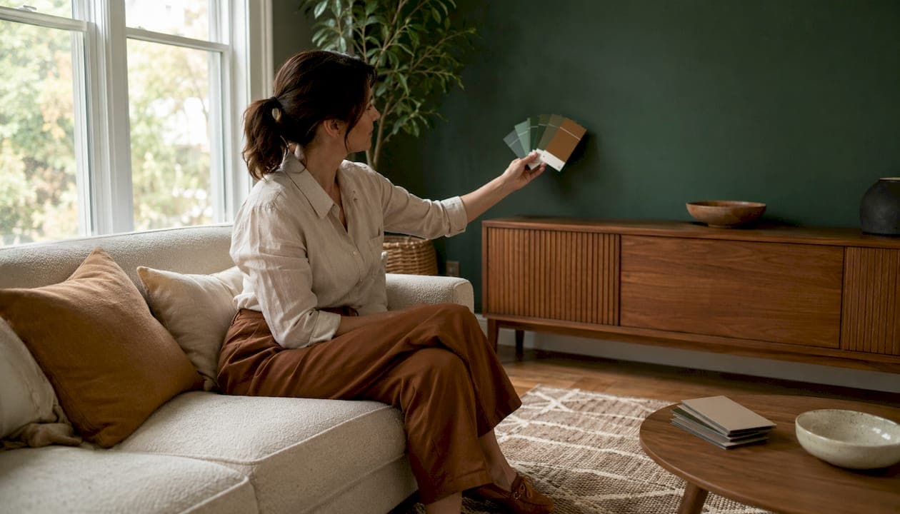
A matte or satin deep-tone paint anchored to your room's existing palette, then extended with architectural texture like wood slats, fluted paneling, or stone veneer, is the single most effective approach to a luxury living-room media wall. The combination controls TV glare, makes the screen feel intentional rather than bolted on, and reads as built-in rather than painted. Here's what to act on right now:
- Finish: Choose matte or satin. Semi-gloss reflects light and fights the screen.
- Placement: Put the accent wall behind the sofa or on the fireplace/media wall, whichever your eye hits first when you walk in.
- Test first: Paint two or three large swatches directly on the wall and observe them morning, afternoon, and evening before committing.
Pro Tip: Themediawallstore offers pre-cut, pre-labeled DIY media wall kits with integrated LED channels and hidden wire management, so you can execute the full paint-plus-architecture look in a weekend without a contractor.
Table of Contents
- What are the best accent wall paint ideas for living rooms?
- Which paint finish works best for a media wall?
- How do you make an accent wall feel truly built-in?
- How do you test paint colors before committing?
- What prep and painting steps give you a clean, professional finish?
- How do you control glare so the TV performs well against the accent wall?
- Five accent-wall concepts you can copy for a luxury media wall
- Before you paint: a quick readiness checklist
- How do accent wall colors shape the mood of a living room?
- How do you pick complementary colors and avoid clashes?
- Can you use multiple colors or gradients on one accent wall?
- What specialty finishes and paint effects add luxury appeal?
- How do you maintain a painted accent wall over time?
- Key Takeaways
- Why texture will outlast color as the defining luxury signal in 2026
- Themediawallstore makes the luxury integrated look achievable for DIY homeowners
- Useful sources
- FAQ
What are the best accent wall paint ideas for living rooms?
The palette you choose should match both your lighting conditions and the mood you want to live with. Here are eight starter palettes grouped by intent:
- Deep and moody: Navy, charcoal, near-black warm brown (like SW Urbane Bronze). Best in bright, south-facing rooms where the color reads rich rather than gloomy.
- Tonal and subtle: Greige two shades deeper than your field walls. The shift is modern and never fights furniture.
- Warm and earthy: Terracotta, warm clay, burnt sienna. Flatters skin tones and warm lighting, a quiet win in any TV room.
- Jewel and luxe: Deep teal, peacock blue-green. Needs brass hardware to land correctly.
- Soft and restful: Sage, mushroom, muted gray-green. Works in north-facing rooms where warmer colors fall flat.
Natural light changes everything. Saturated deep colors work in bright, south-facing rooms but can feel heavy in north-facing or windowless spaces. In those rooms, lean toward warm clay or muted gray-green and add mirrors to bounce light back. Anchoring your accent color to an existing rug, artwork, or drapery is the fastest way to guarantee the wall complements the room rather than competing with it.
| Color family | Mood | Best use |
|---|---|---|
| Navy / charcoal | Dramatic, cinematic | TV wall in bright rooms |
| Warm clay / terracotta | Cozy, earthy | North-facing rooms, media walls |
| Deep teal / peacock | Luxe, jewel-toned | Shelving wall with brass accents |
| Tonal greige | Subtle, modern | Open-plan living rooms |
| Sage / mushroom | Restful, soft | Rooms with greenery views |
Which paint finish works best for a media wall?
Matte and satin are the right calls for a TV wall. Matte hides roller marks and imperfections, and it gives the wall a velvety quality that reads expensive. Satin adds a touch more durability and is easier to wipe down in a high-traffic living room. Eggshell sits between the two and is a solid choice when you want scrubbability without visible sheen.
- Matte: Best glare control, hides wall flaws, slightly harder to clean.
- Satin: Durable, low sheen, good for families with kids or pets.
- Eggshell: Versatile middle ground for most living room accent walls.
- Semi-gloss: Skip it on a media wall. The reflection competes directly with the screen under integrated lighting.
Pro Tip: Test your chosen finish under the room's actual lighting conditions, lamps on and TV running, before painting the full wall. A satin that looks perfect in daylight can develop noticeable sheen under warm LED strips at night.
How do you make an accent wall feel truly built-in?
Paint alone rarely reads as luxury. The 2026 direction is architectural integration: extend material from baseboard to ceiling, align it with adjacent trim and built-ins, and the wall stops looking like a DIY project and starts looking like a custom installation.

Three techniques homeowners can copy directly:
Vertical wood slats add warmth and shadow lines. Run them full height with consistent 0.5–1 inch gaps. Stopping halfway up reads dated. Natural oak, ash, or a light walnut stain work with both modern and Scandinavian-inspired rooms. Themediawallstore's acoustic slat wall panels are pre-finished and sized for a clean install.
Fluted or picture-frame paneling gives a quieter texture. Paint the entire assembly, wall and trim, in the same deep color for a tonal, enveloping result. It works especially well behind a floating console.
Stone or marble-look veneers with slim grout lines read high-end when run floor to ceiling around the fireplace or TV wall. Visible wires instantly kill the effect, so plan cable management before the veneer goes up.
Integrated floating consoles, hidden wire channels, and LED backlighting behind the media gap all lift the perceived finish. The Ambassador Wall kit from Themediawallstore shows what this looks like fully assembled.
Pro Tip: Consistent spacing is the difference between a custom look and a DIY look. Uneven or narrow slat gaps read as rushed. Measure twice, cut once, and use a spacer block for every run.
How do you test paint colors before committing?
- Paint two or three swatches at least 24"×36" directly on the wall where the media setup will sit.
- Observe each swatch in morning light, afternoon light, and with lamps on in the evening.
- Turn the TV on and watch how the color interacts with screen glow and any LED backlighting.
- Photograph the swatches at each time of day for side-by-side comparison.
- Hold fabric samples from your sofa or curtains next to the swatches to check for clashes.
What to look for: does the hue shift warm or cool under artificial light? Does it absorb or reflect TV glare? Does the color next to your sofa fabric look harmonious or muddy? Sampling in the actual room rather than relying on photos or online swatches is the single most-cited piece of advice from design professionals.
Pro Tip: Always view swatches from your main seating position, not while standing next to the wall. The angle and distance change the perceived depth of a dark color significantly.
What prep and painting steps give you a clean, professional finish?
- Repair and sand any holes, cracks, or imperfections with spackling compound; use 120–150 grit sandpaper.
- Prime the wall if you're switching from a light to a dark color. Skipping primer means more coats and uneven coverage.
- Caulk the seam between wall and trim for a crisp edge.
- Remove or mask outlets, switch plates, and hardware.
- Use a quality roller with the right nap (3/8" for smooth walls, 1/2" for light texture) and an angled brush for edges.
- Apply 2–3 thin coats rather than one heavy coat. Thin coats dry faster and level better.
- Remove painter's tape while the final coat is still slightly tacky, not after it has fully dried, to avoid peeling.
Pro Tip: Match the sheen on adjacent trim to the sheen you used on the accent wall. A matte wall next to a high-gloss baseboard creates an unintentional contrast that undermines the built-in look.
How do you control glare so the TV performs well against the accent wall?
A matte or low-sheen satin finish is the foundation. Beyond that, lighting strategy matters as much as paint choice.
Layer three types of light: ambient (overhead), task (reading lamps), and accent (sconces, LED strips). Make every fixture dimmable. A dark accent wall needs lamps and sconces so it doesn't read as a shadow at night. Avoid placing strong directional light directly opposite the TV screen. Warm color temperature (2700–3000K) creates a cozy media feel and reduces the blue-cast competition with the screen.
For glare control during daytime viewing, blackout or light-filtering curtains on adjacent windows make a real difference. LED accessories like concealed channel strips behind floating shelves or inside the media gap add depth without the taped-on look.
Pro Tip: Run LED strips inside a routed channel or behind a lip, not surface-mounted on the wall. The difference between recessed and surface-mounted lighting is the difference between a hotel lobby and a college dorm.
Five accent-wall concepts you can copy for a luxury media wall
- Cinema charcoal: Matte near-black paint (SW Tricorn Black or SW Urbane Bronze) on the full media wall, recessed LED halo behind the TV, floating console in matching dark finish. Best in rooms with good natural light. Pair with the Monaco Noir kit for a complete cinema look.
- Walnut slat wall: Satin deep warm brown behind full-height oak or walnut slats, warm uplights at floor level. Works in any room with natural wood flooring. See slat wall options from Themediawallstore.
- Marble-glow panel: Backlit marble-look veneer with pale warm field walls. The Luxe Marble Glow kit integrates lighting channels directly into the panel system.
- Tonal greige color-drench: Field walls and accent wall in the same greige family, accent wall two shades deeper, built-ins painted the same hue. Subtle, modern, and easy to live with long-term.
- Deep forest green with open shelving: Hunter green behind floating shelves, brass hardware, warm wood accents. Loves a south-facing room. Keep accessories minimal: books, one plant, one sculptural object.
Pro Tip: Scale your art and accessories to the concept. A large-format piece anchors the wall; a cluster of small frames competes with it. Pick one hero object per concept and let the wall do the rest.
Before you paint: a quick readiness checklist
- Confirm the chosen wall is the focal wall your eye hits when entering the room.
- Swatches tested in morning, afternoon, and evening light on the actual wall.
- Finish selected for media use (matte or satin confirmed).
- Lighting plan sketched: ambient, task, and accent sources identified.
- TV mount location, cable routing, and wire management planned before any texture or veneer goes up.
- Kit or materials sourced; LED channels and floating console measured and ordered.
- Allow 24–48 hours between coats and verify LED fixture placement before the final coat.
How do accent wall colors shape the mood of a living room?
Color is the fastest mood lever in a room. Deep navy and charcoal create a cinematic, dramatic atmosphere that makes a living room feel intentional and anchored. Warm terracotta and clay read cozy and inviting, especially under warm-temperature lighting. Jewel tones like deep teal or peacock add a sense of glamour and work best when balanced with neutral upholstery. Soft sage and mushroom are restful without being bland, a good choice for rooms that double as home offices or reading spaces.
The key is matching the mood to how you actually use the room. A TV-focused living room benefits from a receding dark tone that makes the screen feel like part of the wall. A social living room used for entertaining can handle a bolder, warmer color that energizes the space.
How do you pick complementary colors and avoid clashes?
Start with your three non-accent walls. They should be neutral enough, white, off-white, light gray, or greige, to let the accent wall stand out without fighting it. Then match or contrast your trim deliberately: white or off-white trim creates clean separation with almost any accent color. If your trim is stained wood, make sure the accent color doesn't clash with the wood tone. Warm woods pair with greens, terracottas, and warm grays. Cool-toned woods work with blues, charcoals, and soft grays.
Factor in flooring. Dark hardwood plus a dark accent wall can make a room feel heavy. Balance with lighter base walls and plenty of cream or white in the furnishings. Interior door color also plays into the equation: a door in the same color family as the accent wall unifies the room; a contrasting door adds another focal point you may not want.
Can you use multiple colors or gradients on one accent wall?
Yes, and done well it adds real depth. Horizontal stripes in two close-value colors add height to a low-ceilinged room. Use painter's tape rated for delicate surfaces and a level; remove the tape while paint is still slightly tacky. An ombré or gradient effect, dark at the bottom fading to light at the top, requires blending wet paint with a large brush or sponge roller in horizontal sections. It's time-sensitive and easier with a helper.
A color-block approach, two distinct color zones separated by a clean horizontal line at roughly two-thirds wall height, is a strong modern choice for rooms with low ceilings. Paint the lower section a deep color and the upper section a soft white. The visual effect raises the ceiling without any architectural work.
What specialty finishes and paint effects add luxury appeal?
Limewash gives a cloudy, old-plaster texture that flat paint cannot replicate. It works in Mediterranean, transitional, and organic modern rooms. Venetian plaster is applied in thin layers with a trowel and burnished to a slightly glossy finish; it requires more skill but delivers a genuinely luxurious result. Textured paints with fine aggregates create a subtle rough surface that catches light differently across the day.
Metallic finishes, used selectively, add warmth and depth. A warm gold or bronze metallic on a single accent wall behind shelving reads glamorous without tipping into excess. Keep the sheen low elsewhere in the room so the metallic reads as intentional. Grasscloth wallpaper is another option: it adds tactile luxury in neutral living rooms and pairs well with the architectural door and trim trends that favor integrated, cohesive finishes.
How do you maintain a painted accent wall over time?
Satin and eggshell finishes are the easiest to maintain. Wipe scuffs with a damp cloth and mild soap; avoid abrasive cleaners that dull the finish. Keep a small amount of the original paint in a sealed container for touch-ups. Dark colors show dust on nearby surfaces more readily, so plan to dust baseboards and adjacent trim more frequently.
For textured walls like limewash or Venetian plaster, avoid scrubbing. A soft dry cloth removes most surface dust. If the finish chips, spot-repair with the original product and feather the edges to blend. Slat panels and wood veneers benefit from an annual wipe-down with a wood-safe cleaner and a light re-oiling if the finish starts to look dry.
Key Takeaways
A matte or satin deep-tone paint paired with full-height architectural texture and integrated lighting is the most reliable path to a luxury living-room media wall that holds up in 2026 and beyond.
| Point | Details |
|---|---|
| Finish choice | Use matte or satin for media walls; semi-gloss creates glare that fights the screen. |
| Test in-situ | Paint large swatches on the actual wall and observe them at multiple times of day before buying gallons. |
| Architectural integration | Run slats, paneling, or veneer from baseboard to ceiling with consistent spacing for a built-in result. |
| Lighting matters | Layer ambient, task, and accent lighting with dimmable fixtures; use warm color temperature for a cinematic feel. |
| Themediawallstore kits | Pre-cut, pre-labeled kits with LED channels and hidden wire management make the full integrated look achievable as a DIY weekend project. |
Why texture will outlast color as the defining luxury signal in 2026
The single painted contrast wall had a long run. What's replaced it isn't a new color; it's a different way of thinking about what a wall is supposed to do. In 2026, the rooms that read as genuinely high-end are the ones where the accent wall functions as architecture, not decoration. Wood slats that run floor to ceiling, fluted panels painted the same deep tone as the wall behind them, marble-look veneers with integrated lighting channels: these treatments don't just add color. They add mass, shadow, and the kind of tactile quality that makes a room feel considered.
The practical implication for homeowners is straightforward. A single coat of navy paint is a good start, but it's the material extension, the consistent spacing, the integrated lighting, and the hidden wire management, that separates a luxury result from a weekend project. Invest in those elements and the color almost doesn't matter. Get the color right but skip the architecture, and the wall will look dated within a few years as trends shift.
Themediawallstore makes the luxury integrated look achievable for DIY homeowners
Getting the paint right is step one. The harder part is integrating the TV, wiring, lighting, and cabinetry so the whole wall reads as one cohesive installation rather than a collection of separate purchases. That's the gap Themediawallstore was built to close.
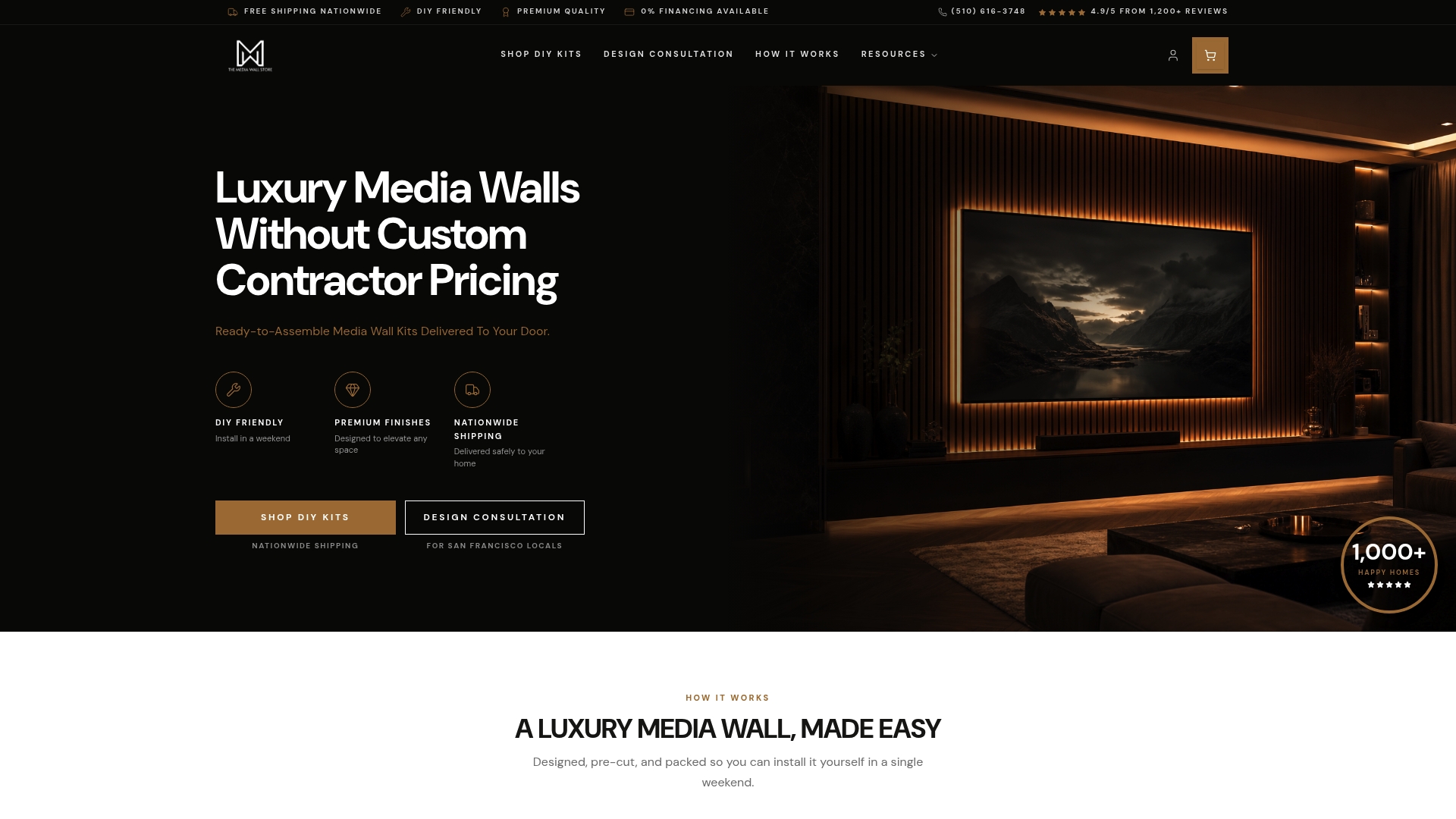
Their kits arrive pre-cut and pre-labeled, with integrated LED-ready channels, hidden wire management built into the panel system, and floating cabinetry options that align with the wall treatment. You get the architectural result without the custom-build timeline or price. Over 1,000 homeowners have used these kits to go from blank wall to finished media installation in a single weekend. Browse the full kit catalog to find the right match for your room dimensions and finish preference, or explore bespoke custom designs if you're in the San Francisco Bay Area and want a white-glove installation. Test your paint swatches first, then order the kit that fits the concept.
Useful sources
- Benjamin Moore — Accent wall color ideas and testing guidance — backs the advice to sample in-situ and anchor color to existing textiles.
- Facade Colorizer — 25 living room accent wall ideas — practical color and placement examples including navy, charcoal, and tonal greige.
- Nordic Design Blog — Color drenching vs. accent walls 2026 — covers finish choices and the trend toward tonal, architectural treatments.
- Tidy Home Guide — Living room accent wall colors — finish guidance and painting tips for DIY homeowners.
- Themediawallstore — DIY media wall kits — pre-cut kits with integrated LED channels and hidden wire management.
- Themediawallstore — Slat wall designs — slat panel options and installation examples.
- Themediawallstore — Luxe Marble Glow kit — marble-look panel system with integrated lighting.
FAQ
What is the best paint finish for a living room accent wall?
Matte or satin finishes work best for most living room accent walls, especially media walls. They minimize glare, hide imperfections, and give the wall a quality look that semi-gloss cannot match.
Should an accent wall be lighter or darker than the other walls?
Darker is almost always the stronger choice. A deeper color recedes visually, adds depth, and frames the furniture in front of it. A tonal shift of two or more shades reads as intentional; a half-step shift reads as a mistake.
How do I choose an accent wall color that works with my existing furniture?
Pull a color from an existing rug, artwork, or drapery in the room, then test large swatches on the actual wall under your room's lighting before committing to a full gallon.
Which wall in a living room should be the accent wall?
Choose the wall your eye hits first when you walk in, typically the fireplace wall, the media wall, or the wall behind the sofa. Avoid walls dominated by large windows, since backlight flattens any deep color.
Can Themediawallstore kits work with any accent wall paint color?
Yes. Themediawallstore's pre-cut panel kits are finish-agnostic and pair with any paint color you choose for the surrounding wall. The integrated LED channels and hidden wire management work regardless of the paint treatment behind them.