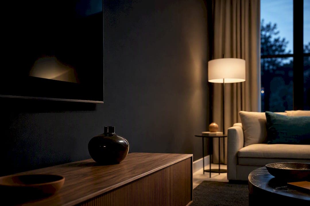
Pick a matte, low-sheen backdrop in a warm-dark or warm mid-tone, then test it at night before you commit. Warm charcoal, deep navy, and warm mid-tone neutrals all work in most rooms because they cut reflection and make the screen disappear when it's off. Whatever shade you land on, buy a sample pot and check it at viewing distance after sunset before you paint the whole wall.
TL;DR:
- Dark, warm neutrals like charcoal, navy, or green are safest for reducing reflections and focusing attention on the TV screen.
- Room lighting and orientation greatly influence the best shade; north-facing rooms need warmer tones while south-facing rooms can handle cooler, deeper colors.
- Testing paint samples at night in the actual viewing location prevents costly mistakes caused by lighting shifts that alter the perceived color.
- Matte finish paint and gray-tinted primer are essential to minimize glare and ensure even coverage for dark-colored TV walls.
- Adding textured elements or bias lighting enhances the aesthetic and prevents the wall from feeling flat or like a blank hole.
Table of Contents
- Which Paint Colors Work Best Behind a TV?
- How Do You Choose a Color Based on Your Room's Light?
- Paint Finish, Primer, and Prep for a TV Wall
- Styling a Painted TV Wall So It Looks Intentional
- Mistakes That Ruin a TV Wall Color, and Quick Fixes
- Pairing Paint With a DIY Media Wall Kit
- Testing Undertones Against Your Own Floor
- Upgrade Your TV Wall Beyond Paint
- Sources
- FAQ
Which Paint Colors Work Best Behind a TV?
The right color for a TV wall does one job: it should make the screen the only bright thing in the room. That's why designers keep landing on dark, low-sheen backgrounds like charcoal and navy. They reduce distracting reflections and let the screen read as the visual anchor of the space instead of competing with a busy wall around it.
Dark neutrals are the safest starting point for most living rooms. A warm charcoal, a near-black espresso, or something in the Phantom family from PPG hides the bezel, hides dust, and hides the seam where the TV meets the wall. The trick is staying warm. A cool, blue-based dark gray can look flat and a little cold once the sun goes down and lamps take over, especially against oak or walnut furniture.
Deep blues and greens bring more personality without losing that anchoring effect. Something in the Tahitian Treat family, a deep teal, or a bottle green reads as dramatic and intentional in a room with good ambient lighting, layered rugs, and warm-toned wood. In a smaller room with less natural light and a more minimal furniture palette, that same shade can tip cold and closed-in. Context decides which side you land on.
Not every household wants a dark statement wall, and that's fine. Warm mid-tones are the underused middle ground: dusty sage, warm taupe, and terracotta still hold their own around a screen, without the commitment level of a near-black wall. They're forgiving in rentals-turned-permanent homes, in rooms shared with kids or renters down the line, and in spaces where you want warmth more than drama.
Light colors are the riskiest choice, though they're not automatically wrong. A soft warm white or a pale greige can work in a bright, south-facing room where the TV sits opposite a window and glare is already a problem. The mistake is defaulting to a cool light gray because it feels "safe." Cool light grays wash out at night, throw more reflection off a glossy screen bezel, and make the TV look smaller instead of anchored.
Quick reference for choosing a lane:
- Warm charcoal or near-black: best for rooms with mixed or low light, hides screen bezel and wall imperfections.
- Deep navy or bottle green: best for rooms with strong ambient lighting and warm wood tones nearby.
- Terracotta or dusty sage: best for daytime-heavy living rooms that still want color without heavy drama.
- Warm mid-gray or greige: best for smaller rooms where a full dark wall feels too enclosing.
- Cool light gray: generally the weakest option behind a TV, even though it's the most common default.
How Do You Choose a Color Based on Your Room's Light?
Your room's orientation matters more than most people think, and it's the fastest way to narrow down a shortlist before you buy a single sample pot.
- Figure out your light direction first. North-facing rooms get flat, cool light most of the day, so warm undertones (charcoal with brown or red bias, warm navy) balance that coolness. South-facing rooms get strong, warm light and can handle cooler dark tones or even a saturated green without feeling cold.
- Check east and west separately. East-facing rooms are bright and cool in the morning, dim and warm by evening, so a mid-tone with a warm undertone tends to look consistent across both. West-facing rooms get harsh warm light late in the day, which can make already-warm paint look almost orange, so a slightly cooler charcoal or navy balances that out.
- Match undertones to what's already in the room. Walk the room and note your flooring, trim, and any wood furniture near the TV. Warm oak or walnut wants a warm-based dark color; cool white oak or gray-washed floors can handle a cooler charcoal without clashing.
- Adjust darkness based on when you actually watch TV. A household that watches mostly in daylight can go slightly lighter and still get glare control, while a household that watches mostly after dark benefits from committing to the deeper end of the color, since the wall barely reads as a color at all once the room is dim.
- Run the actual test before buying gallons. Paint a large sample board, at least 12 by 12 inches, and prop it directly behind where the TV sits. Check it midday, check it at dusk, and check it again with the TV on and the lights low, because undertones and perceived depth shift dramatically depending on the light hitting them.
That last step is the one people skip, and it's the one that causes the most repaint jobs. A color that looks perfectly balanced at 2 p.m. can turn purple, muddy, or oddly blue once the sun sets and your lamps take over.
Paint Finish, Primer, and Prep for a TV Wall
Finish matters here as much as color, maybe more. Matte or flat finishes are the standard recommendation directly behind a screen because they scatter light instead of bouncing it back at the viewer, which keeps glare off the TV itself. Eggshell or satin will hold up better against fingerprints and cleaning, which matters in a hallway or a rental, but expect a bit more sheen and a bit more reflected light in a dark room.
Switching from a pale builder's beige to a deep charcoal or navy is a bigger job than people expect. Use a tinted gray primer, not white, before you roll on a dark topcoat. That single step often saves you an entire coat of paint, since dark colors over white primer tend to need three or more coats to look even, while a properly tinted primer can get you there in two.
Sequence matters too. Paint the full wall, including the area behind any planned shelf, floating console, or mounting bracket, before you install hardware. Trying to cut in around an already-mounted TV or bracket is slower and leaves visible touch-up marks later.
Supplies worth having on hand:
- Gray-tinted primer (not white) for dark topcoats
- A quality angled brush for cutting in around outlets and mounts
- Painter's tape for any trim or molding lines
- A microfiber roller for a smoother finish on flat paint
Pro Tip: Order your primer tinted to roughly 50 percent of your final color at the paint counter. It cuts your topcoat down to two coats almost every time, even on deep navy or true black.
Most homeowners can handle this as a weekend DIY project. If your wall has patched drywall, uneven texture, or multiple corners and angles, a professional painter will get a cleaner result faster, especially with darker colors where every roller mark shows.
Styling a Painted TV Wall So It Looks Intentional
A dark or richly colored wall needs something to break up that flat plane, or it can start to look like a hole in the room instead of a design choice. Bias lighting, a thin LED strip mounted behind the TV, is one of the simplest fixes. It rims the screen with soft light, keeps a matte dark wall from feeling like a black void, and reduces eye strain during nighttime viewing.
A few other moves make a painted wall read as finished rather than half-done:
- Add a floating console or a slim shelf below the TV instead of leaving the paint to run edge to edge with nothing to interrupt it.
- Use slatted wood panels or a textured accent element behind the screen to keep a matte dark color from feeling flat.
- Echo the wall color in a throw pillow, a vase, or artwork elsewhere in the room so the dark backdrop doesn't feel isolated from everything else.
- Skip stark trim against a very dark wall. Warm wood tones or a slim black frame tend to look more deliberate than bright white molding.
This is where a DIY media wall kit earns its keep. Floating cabinetry and slat accent panels give a dark wall dimension and rhythm instead of one flat rectangle of color, which is exactly why a painted backdrop paired with texture reads as a real design choice rather than a leftover paint job.
Mistakes That Ruin a TV Wall Color, and Quick Fixes
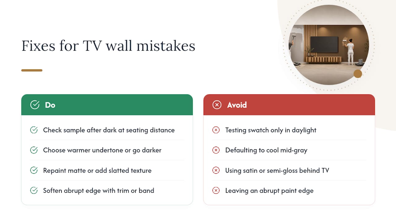
The most common mistake is testing a swatch only in daylight, then discovering at 9 p.m. that the color has gone muddy or too dark. Fix it by checking your sample after dark, at the distance you actually sit from the TV.
The second mistake is defaulting to a cool mid-gray because it feels neutral and safe. It often reads flat and a little cold against warm wood floors. Choose a warmer undertone or move a shade darker instead.
Using satin or semi-gloss right behind the screen is another common slip. That sheen bounces light straight back at viewers. Repaint in matte, or add a slatted texture to diffuse the reflection.
Finally, watch for abrupt paint edges where a dark accent wall stops dead against a plain wall. A thin trim strip, simple molding, or a soft paint band solves it cleanly.
Pro Tip: If you're not ready to commit to a full wall, paint just the section directly behind the TV first and live with it for a week before extending the color further.
Pairing Paint With a DIY Media Wall Kit
Slat panels and floating shelving change how a dark wall reads. Instead of one flat plane of paint, you get shadow lines and texture that make charcoal or navy feel architectural rather than accidental.
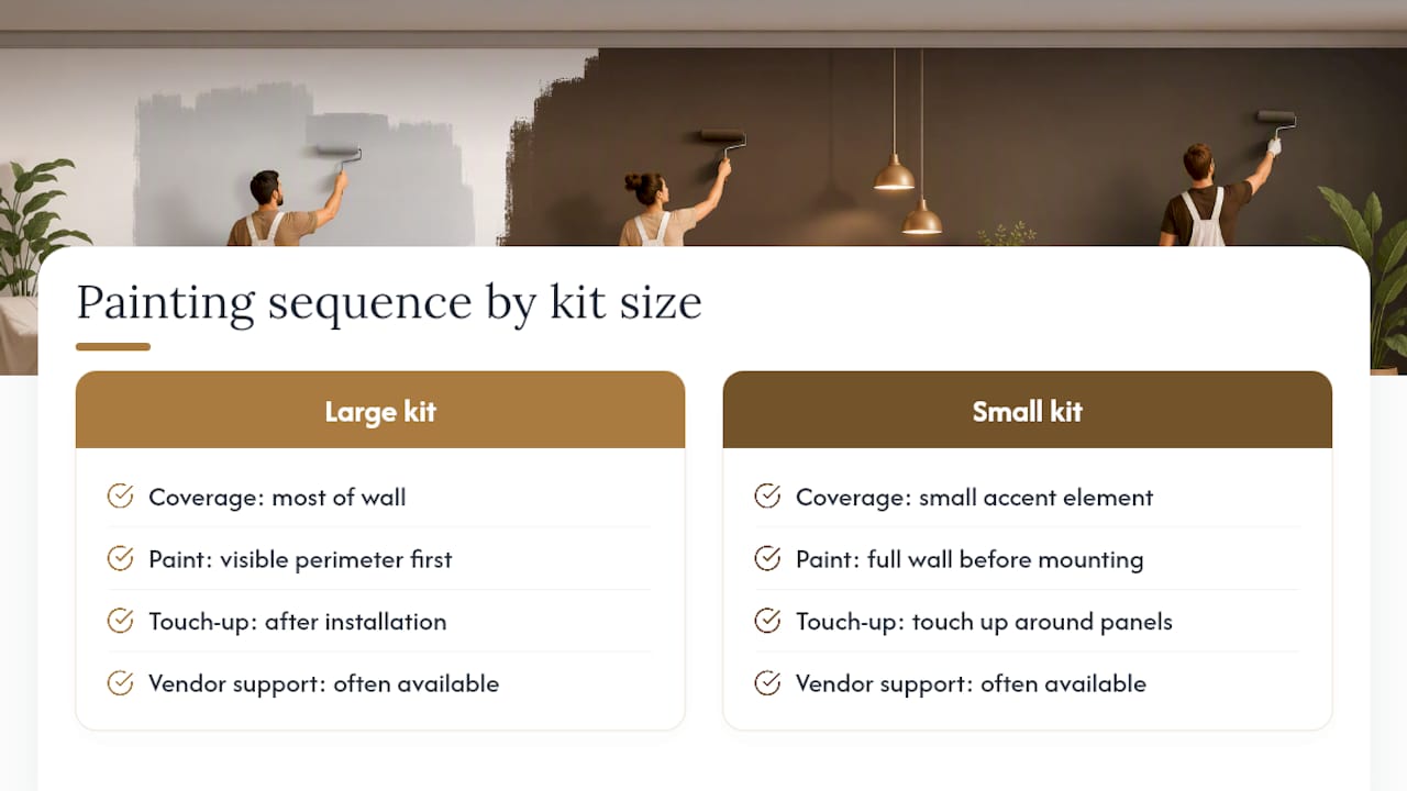
Sequencing depends on coverage. If the kit spans most of the wall, paint the visible perimeter first and touch up around the panels after installation. If it's a smaller accent element, paint the full wall before mounting anything.
Some companies have supported many homeowners through this exact pairing, sometimes offering expert support and risk-free returns. Readers weighing a fuller upgrade can browse media wall design ideas for inspiration before deciding how far to take it.
Testing Undertones Against Your Own Floor
Sample boards lie in daylight and tell the truth at night. That's the whole reason to prop a large swatch against the wall and walk away from it until the sun's down. A charcoal that looked neutral at noon can pick up a faint blue cast once your lamps kick on, and that's usually the moment a homeowner realizes their flooring has more red in it than they thought.
My advice is boring but it works: paint a section, not a whole wall, and live with it through one full day and one full evening before buying more. A small mockup costs you a sample pot and a weekend. A wrong full wall costs you a repaint.
— Jake
Upgrade Your TV Wall Beyond Paint
Paint solves color and glare. It doesn't solve the flat, unfinished look a lot of TV walls have once the color goes on. That's the gap Themediawallstore's kits are built to close. Every kit ships pre-cut and pre-labeled, designed for a weekend install with no contractor required, so you get the layered, textured look of a custom build at a fraction of the cost.
A matte charcoal or navy wall pairs especially well with the Acoustic Slat Wall Panel in Red Walnut, which adds warmth and shadow lines against a dark backdrop, while lighter warm neutrals suit a cleaner floating console setup. Browse the full DIY media wall kit lineup to see which style fits the wall you just painted, and get a kit on order this week if you're ready to finish the look for good.
Sources
- Best paint for a Wall Mounted TV - Boston South Shore
- Why Your TV Wall Is Practically Made for the Dark Wall Trend
- PPG color family - Phantom
- What Color to Paint Behind Your TV: What Works » EasyCozyHome
FAQ
What Color Should You Paint Behind a TV?
A warm charcoal, deep navy, or warm mid-tone neutral in a matte finish works for most rooms because it cuts glare and makes the screen the focal point instead of the wall.
Should the Wall Behind the TV Be Light or Dark?
Dark, low-sheen colors generally work better because they reduce reflections and hide the bezel, though light rooms with strong natural glare can sometimes handle a warm light neutral.
What Is the Best Wall Color for a TV Wall With Limited Natural Light?
Warm dark neutrals or warm mid-tones like terracotta perform best in low-light rooms, since cool grays tend to look flat and lifeless without much daylight to warm them up.
What Should You Put on a Wall Behind a TV?
Beyond paint, a floating console, slatted wood panel, or bias LED lighting adds texture and depth. Some DIY media wall kits include floating consoles, slatted wood panels, and bias LED lighting without the need for a contractor.
Do You Need a Special Primer for Dark Paint Behind a TV?
Yes. A gray-tinted primer instead of white typically cuts your topcoat down to two coats even on very dark colors like navy or charcoal.